Data Visualize With Flask and Highcharts
data visualization with the back-end Flask and front-end Highcharts
What Happened
Our company uses Alibaba’s open source zeus and combines scripts to build a schedule system. There was a phenomenon of sudden collapse of the job in the evening (the early warning SMS burst), and the data could only be rewashed during the day. After research, it is found that the task is way too intensive in a certain period of time and excessive parallel pressure is the cause. The time of the ods/mds/ads table needs to be reasonably distributed. However, the zeus system itself does not provide the function of the query scheduling task, so it is necessary to implement the visualization of a task distribution.
Flask Backend Framework
Although usually I’m used to use Django, but it is too heavy as a Full-Stack Framework,the registration and login functions inside will not be used. So I switch to Flask:query from MySQL in real time, convert the result with the built-in jsonify and return it to the front-end page.
Zeus’s scheduling time format is similar to crontab, so in order to generate the required data directly on the backend, it should convert the time into an int value. such as:
original time    show time
0 10 1(means 1:10) 110
0 16 0 (means 12:16)   16
0 30 23(means evening 11:30) 2330
If the time does not meet the four positions when you look at it, you need to complete the leading zero to see.
The core of time is as follows:
“starthighlight” for row in cur.fetchall(): key = row[1].split() if key[2]!='0’ and key[1]=='0’: key=10*int(key[2]+key[1]) else: key = int(key[2] + key[1]) “endhighlight”
configuring post data:
“starthighlight” @app.route('/timeserialize’, methods=[‘GET’, ‘POST’]) def get_json(): # calculate some data return jsonify(result) “endhighlight”
Highcharts FrontEnd Framework
There are two famous visualization framework,one is Echarts opensourced by Baidu,and the other is Highcharts opensourced by Google(D3.js is mainly for animation).I choose the latter one.
Adding the resource files firstly.
<script src="http://cdn.bootcss.com/bootstrap/3.3.0/js/bootstrap.min.js"></script>
    <link rel="stylesheet" type="text/css" href="{{ url_for('static', filename='styles.css') }}">
    <!-- jquery.min.js must put before highcharts.js 之前 -->
    <script src="{{ url_for('static', filename='jquery.min.js') }}"></script>
    <script src="{{ url_for('static', filename='highcharts.js') }}"></script>
Then use jquery to configure JSON data in POST format.
<script>
$(function () {
    $.getJSON('/timeserialize', function (data) {
    /*$.getJSON('/configure', function (data) {*/
        $('#container').highcharts({
            // legend,option...data
        });
    });
});
</script>
First Version
The display after the first version is as follows:


The number of points refers to the number of jobs running at the current point in time. Drag and drop to see changes in a finer time dimension.
Second Version
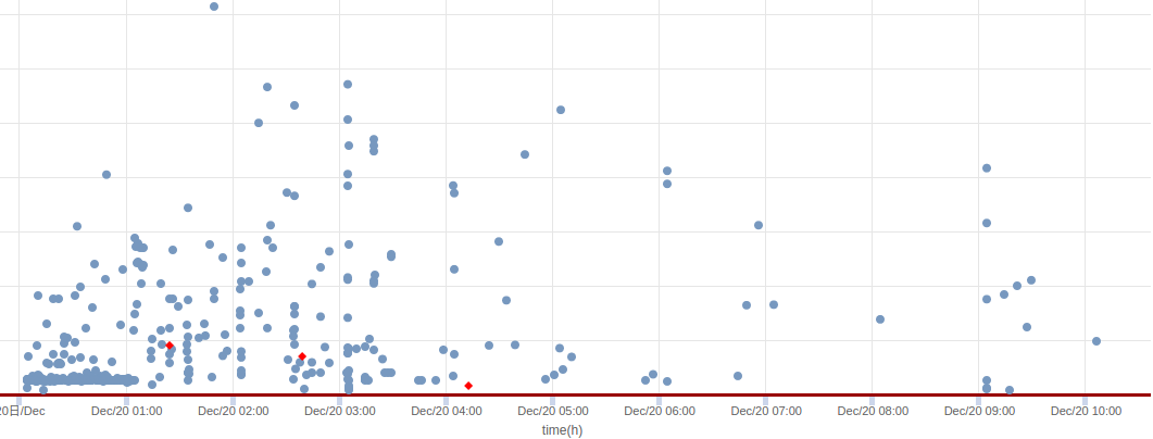
After combining the obtained time format and the specific number of seconds, You can get the specific execution time of the task, and transfer it to unixtime and pass it to the front end, then turn it to specific time, the visual effect will be better.
The key is to add a function to the JSON format in $function().
var jsonData = data;
var jsonDataSuccess = new Array();
var jsonDataFailed = new Array();
# ...
tempArray.push(parseInt(jsonData[i].startTime) + 28800000,parseInt(jsonData[i].spendTime));
# ...
In the series, use two types to mark:
    series:[{
            name:'success',
            color:'rgb(119,152,191)',
            data:jsonDataSuccess,
            },{
            name:'failed',
            color:'rgb(255,0,0)',
            data:jsonDataFailed
            }
                    ]
Using the formatter() option in tooltip to return a more friendly expression:
tooltip:{
    formatter: function() {
        //...
        return 'jobid :' + jobId + '<br>' + "jobName:" + jobName + '<br>'  + 'starttime :' + startTime
    }
}
The resulting visualization results are as follows:
